Fat Tire’s Bold Rebrand Trumpets Sustainability With Good Design

At the same time, efforts to reduce the impact of their already efficient brewing process spurred recipe experiments, too. “Because of the different tweaks we were making, we started to also get different flavor outputs from these recipe batches,” shares Boyd. And even though the impact reduction efforts didn’t yield big enough results to tout too loudly, the crisp new flavor profile stuck. “We decided to continue down that path to essentially brew the best Fat Tire that we know how to—a better version brewed using everything that we’ve learned over more than 30 years of brewing.”
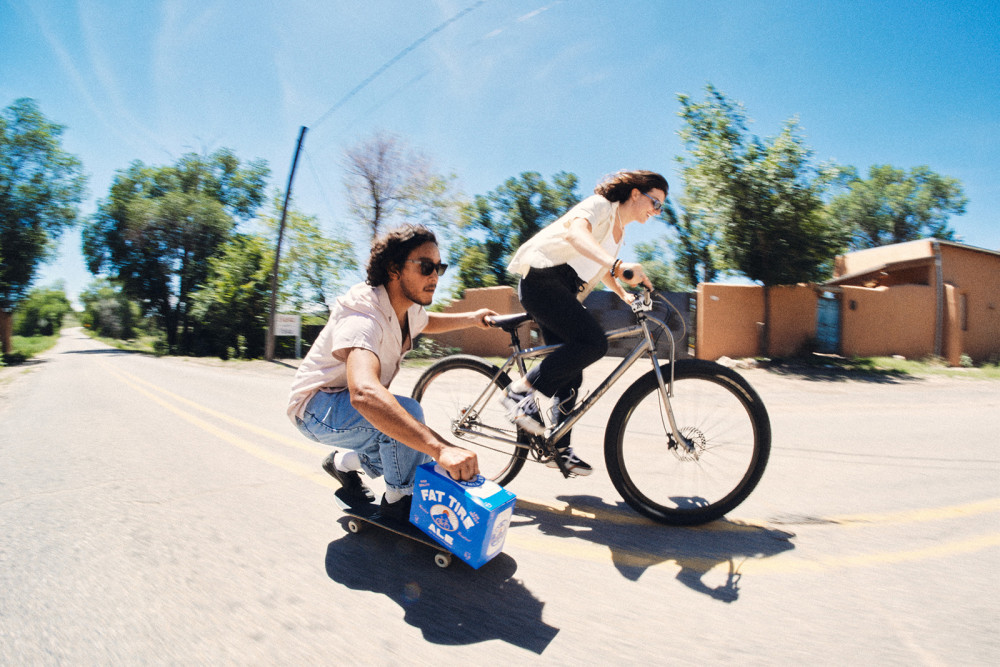
This pretty much sums up the new redesign as a whole. To use a marketing cliche, you could call it “new and improved,” but the change goes deeper—it’s rooted in the brand’s true DNA. Change-averse fans may cry foul on the new recipe or shed a tear for the loss of the beloved vintage red cruiser bicycle, but for the first time ever the bike on the label—a late ’80s Specialized Stumpjumper—is truly representative of the one co-founder Jeff Lebesch toured Europe on, the very ride that inspired the original batch of Fat Tire.
Regardless, at the end of the day when it comes time to enjoy a few cold ones with your pals, whether hard earned on the trail or behind the keyboard, the shiny new look, new easy drinking recipe, and renewed commitment to the only planet with beer make Fat Tire an easy reach if you ask us.
Source: https://www.fieldmag.com/articles/fat-tire-rebrand-land-design-full-story


